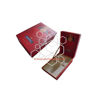
wine packaging | looks like lantern
wine packaging | looks like lantern:
Nowadays, along with the influence of China has been increasing day by day, more and more wine packaging designers | would like to integrate Chinese traditional elements into luxury wine packaging |. For example, lantern, red and royal patterns which appear in ancient Chinese imperial palace, etc. These kinds of wine packaging design | elements are considered as part of fantasy wine brand stories as well as luxury elements, as ancient China was considered as advanced nation all over the world at that era. custom wine packaging | for JACK DANIEL's is one of excellent case to apply traditional Chinese elements:
Maybe you challenge me that you can't detect lantern element on above custom wine packaging |. Now, please look at the following picture shown you more detail about how lantern wine boxes | work:
The above image shows you the inner of rigid wine packaging boxes |, it looks like the core of lantern. When your wine bottle is placed inside this inner tray, then your wine will be considered as the light of lantern, that means your wine and bottle will become the main actor and focus of luxury wine packaging boxes |.
As i have mentioned above, royal imperial patterns are also applied to lining of wine gift boxes |. This is another key factor to manifest luxury value of your wine. It reminds your end consumers of that your wine belongs to royal grade constantly. Another one luxury wine packaging design | applies royal elements:
Additionally, Chinese red is always applied to luxury wine packaging design |:
In fact, red belongs to warn tone which is also used to stimulate gourmet consuming desire. That is the part reason why famous wine or chocolate or gourmet brands would like to adopt Chinese red to their product packaging design |.
标签: custom wine packaging, luxury wine packaging, wine boxes, wine gift boxes, wine packaging, wine packaging boxes, wine packaging design


0 条评论:
发表评论
订阅 博文评论 [Atom]
<< 主页